Design Principles Document

Joey M. Panganiban

PARC: Contrast

Samsung

samsung.com/ph
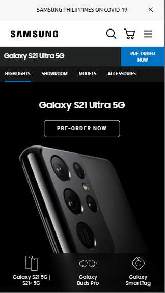
samsung

The white background-color with color black head-title: SAMSUNG creates a good contrast for the picture below. The picture u black theme that compliment to the heading. We know that white and black colors are good contrast in the sight of the users.

PARC: Proximity

Microsoft

microsoft.com

micrisoft

The Microsoft websites site showed an example of good proximity. The first group, which composed of the navigation, search button, cart, title, introduction and picture showed that they are relating to each other. The second group, sub title, paragraph, and buttons showed the information needed to order the product.

PARC: Repetition

ABS-CBN

abs-cbn.com

media-site

ABS-CBN websites showed a good repetition, interms of color and font. They uses red color based from their company logo in their selected font and sub-heading. They are also consitent in using black color for their fonts. The logo also used as the background color for the official logo for the heading. Also in the picture which has a red theme.